Building a Shared Typography and Layout System for Three Brands
Building a Shared Typography & Layout System for Three Brands
This post sketches a shared typography and layout system for three closely related companies/brands: The Builder Coil, Chronomation, and Ball Lightning.
It’s not a locked-in design language. It’s a first iteration of a system to test in the real world, starting tomorrow when I begin rebuilding BallLightning.cloud based on the current TheBuilderCoil.com codebase as a self-made boilerplate.
The goal: make it easier to keep three brands coherent, while leaving room for experimentation—especially around readability for Chronomation as an app, where ease-on-the-eye matters more than a few minutes of “nice blog reading”.
Why bother with a shared system?
All three brands sit in the same universe:
- The Builder Coil – the devlog and narrative layer
- Chronomation – the automation engine and app
- Ball Lightning – the company and portfolio
They already share code and infrastructure. The type and layout system is an attempt to give them a shared backbone too, so that:
- Decisions are made once, then reused.
- New pages start from tokens and patterns, not from scratch.
- Each brand can still express its own accent and tone on top.
This post is simply documenting the first pass at that backbone.
Two type baselines to try
For now, there are two main font “modes” to experiment with. They’re not final assignments per brand, just starting points that feel promising.
1. JetBrains Mono – code-flavoured baseline
- Stack:
"JetBrains Mono", ui-monospace, SFMono-Regular, Menlo, ... - Body weight: 400
- Heading weight: 500
This keeps the “console / engineering” feel that fits The Builder Coil and the more technical parts of Chronomation. It’s also partly what I’m already using here, albeit with only one font + font spacing replacing two different fonts, so there’s less friction adopting it.
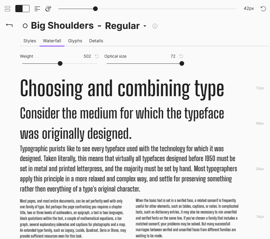
2. Big Shoulders – condensed display baseline
- Stack:
"Big Shoulders", system-ui, -apple-system, "Segoe UI", sans-serif - Single weight: 500 for both body and headings
This is more of a display / poster feel. The idea is to try it on select pages (for example, a landing page or campaign layout) and see how it behaves when everything is set in one weight, with strong uppercase headings. This is also about finding "my font" for my brands, rather than an established font seen on a million pages already.
The current plan is to treat these as alternatives to test:
- Some pages in pure JetBrains mode.
- Some pages in Big Shoulders-only mode.
- Compare readability, character, and how well they scale across devices.
Chronomation, in particular, will likely push things toward maximum readability and low visual fatigue, so its final typography might lean a bit softer and more neutral than The Builder Coil, which can stretch things more towards the extremes.
Base text: body first, hero later
The system starts from body text, not hero headlines:
- Base font size: 16px (1rem)
- Body line-height: 1.5 (150%)
- Max line length for long-form: ~70 characters
This should be comfortable for both blog posts and app-like views.
There’s also a slightly denser longform_alt body style at ~15px with line-height 1.6 for documentation-style content or narrower layouts. That variant will be useful to test on more information-heavy Chronomation views.
A modular type scale (major third)
To avoid tuning every heading by feel, the first iteration uses a modular scale:
- Ratio: 1.25 (major third)
- Base: 16px
That produces this ladder:
p(body): 16px (1.00rem)h6: 20px (1.25rem)h5: 25px (1.5625rem)h4: 31.25px (1.9531rem)h3: 39.06px (2.4414rem)h2: 48.83px (3.0518rem)h1: 61.04px (3.8147rem)
These values are then mapped into Tailwind-friendly rem sizes, with clamp() for H1 and H2 so large headings adapt across breakpoints.
This is all still a sketch. If it feels too steep or too shallow while rebuilding BallLightning.cloud, the ratio is easy to adjust.
Tracking and line-height per level
The system also experiments with tracking (letter-spacing) and line-height by heading level.
Tracking
- Body (
p):0em - Small labels / badges:
0.01em(slight positive tracking) - Headings: progressively tighter tracking as size increases
- H6: around
-0.005em - H1: around
-0.020em
- H6: around
Big Shoulders is naturally condensed, so the negative tracking is slightly lighter there—still tight, but not crushed. The effect to aim for is: large headings feel compact and intentional without harming legibility.
Line-height
First pass:
p: 1.5h6: 1.35h5: 1.3h4: 1.25h3: 1.2h2: 1.1h1: 1.0
Larger headings become visually denser and more “solid” blocks in the layout. During implementation, this is something to watch carefully on small screens.
Vertical rhythm and spacing
Typography isn’t just font choices—it’s spacing around the text.
The layout guidelines currently use a 4px base unit for consistent rhythm:
- Base unit: 4px
- Spacing built in multiples of 4px and 8px
Some early patterns:
- Paragraph gap: ~12px (0.75rem)
- Paragraph → H2 gap: 1.5rem, with more space above headings than below
- Card title → body: 0.5rem
Two recurring title patterns:
Hero title
- H1 plus supporting text limited to ~45 characters (
max-w-[45ch]) - CTA stack with consistent gaps (
gap-4 md:gap-6)
- H1 plus supporting text limited to ~45 characters (
Section title
- H2 or H3 as the main label
- Top spacing:
mt-12 md:mt-16 - Bottom spacing:
mb-4 md:mb-6 - Optional eyebrow label (H6) in a brand accent
These are starting points. The real test is how they behave when applied to actual Ball Lightning content tomorrow.
Tailwind mappings and implementation
The YAML config includes suggested Tailwind mappings so the system is directly usable in code:
- Body base:
text-[1rem] leading-[1.5]
- Longform alt:
text-[0.9375rem] leading-[1.6]
Headings for each mode:
JetBrains Mono headings:
clamp()sizes for H1–H2, then fixed rem sizes for H3–H6, with matching tracking and line-heights.Big Shoulders headings:
Similar scale, mostly uppercase, slightly different tracking and subtly different line-heights to suit the condensed shapes.
These mappings are likely to evolve once they’re applied to real pages. The benefit of having them defined in YAML is that they can be tweaked in one place, then rolled out across all three brands.
How this will be tested
The next concrete step is:
Rebuild BallLightning.cloud using the current TheBuilderCoil.com build as a boilerplate, and apply this typography and layout sketch as the baseline.
That will be the first proper test of:
- The modular scale in real content
- How JetBrains Mono feels as a primary UI typeface outside The Builder Coil
- Where Big Shoulders works well as an alt mode (and where it doesn’t)
- Whether the current vertical rhythm feels natural across hero sections, blog content and more “portfolio” style pages
For Chronomation specifically, readability and low eye strain will be the hard requirement. If that means adjusting the scale, easing the contrast, or softening some of the more “display” choices, the system will adapt.
This post is simply a snapshot of the first iteration before it hits production.
Hero image options
Three 1:1 hero image concepts for this post:
Typography Blueprint
A dark, minimal layout grid with a large H1, smaller headings, and body text blocks, annotated with small labels like “70ch” and “1.5× line-height”.
Alt text: “Blueprint-style diagram of a web typography system showing headings, body text and spacing annotations.”Three Brands, One System
Three overlapping cards labelled subtly as The Builder Coil, Chronomation, and Ball Lightning, all using the same type hierarchy but different accent colours.
Alt text: “Three brand panels sharing the same typography hierarchy but with different accent colours.”Font Modes Switch
A split screen: left side shows a JetBrains Mono-based interface, right side a Big Shoulders display layout, with a small toggle icon between them.
Alt text: “Split-screen comparison of JetBrains Mono and Big Shoulders layouts connected by a mode toggle.”
The Builder Coil now has an X account. Unfortunately due to X anti-bot measures in combination with zero support, @thebuildercoil is reserved by a suspended account, so @buildercoil is what will be used henceforth.
Related Posts
The Memory Bank: Theory, Practice, and Agentic Pair Programming
A practical spec system for working with AI coding agents: why I built a memory-bank, how it works day-to-day, and why The Builder Coil version is the template moving forward.
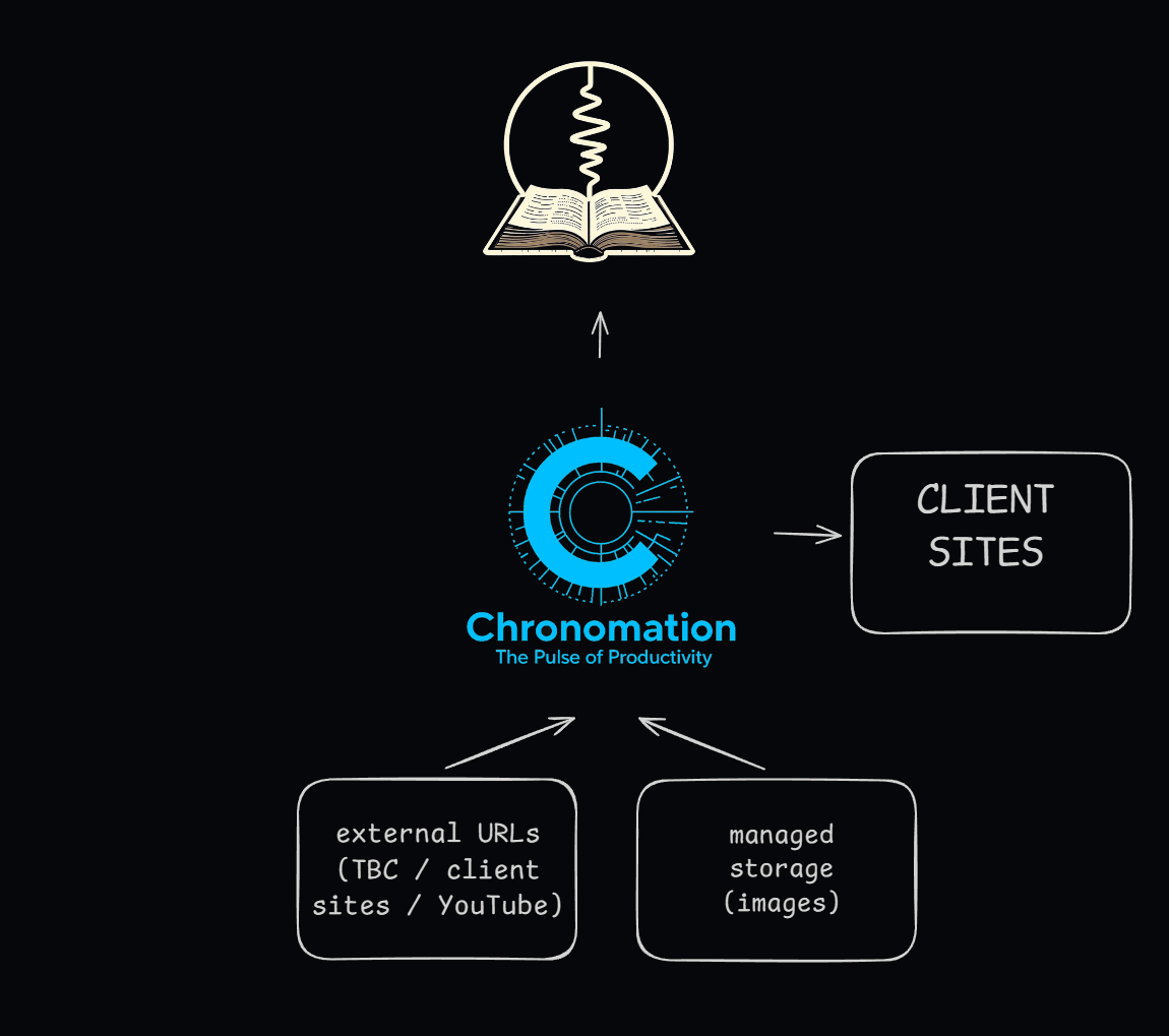
Designing Media Hosting for The Builder Coil
How I’m designing media hosting for The Builder Coil and Chronomation: from simple file-based images to multi-tenant media for future clients.

Chronomation: Key Architecture Decisions
A deep dive into the architecture decisions behind Chronomation – our multi-tenant content engine. Why we chose Neon, Drizzle, and a tenant-first data model.